The Structure of the Spruz Social Site

The Structure of the Spruz Social Site -- To Begin:

As most of my fellow Spruz owners know, a recent change to Spruz help forums deleted a large archive of advice and coding which we had been using to configure our sites. An enormous wail of dismay went up from everyone over this. I was in better position to cope than many as I had been an admin on our Spruz sites for a couple of years, and had saved some of the coding. As yet Spruz has not restored our access to our archived material.

I have posted a lot on My Spruz. It's not because I like to yak, or create work for myself, but because I am committed to Spruz's success. I don't want to see a Ning-like disaster spring up on Spruz, nor any of my fellow owners become discouraged if I can assist in any way. Let's see if we can possibly set some 'style sheet' method for styling our sites to replace the archive we lost.

I am going to link this post to another site because:

  • It will gradually become HUGE
  • I don't want a change in discussions/forums to delete it
  • And we know about that one, don't we ...

edited: 30jan2015

Rate0

Replies

  •     The Structure of the Spruz Social Site -- Basic: The Element Tree

        In order to know why our CSS selectors do or do not work for us, it's necessary to understand the basic structure of the page we are trying to style. Microsoft provides a useful one-key tool in Internet Explorer to analyze web pages, and its the F12 key. I use IE version 9. Going to a popular Spruz site, and pressing F12, we get a tree of elements provided by IE.

       
        Selecting and expanding the body node, we see that the page consists of a stack of divisions separated by empty span tags. On the right are the CSS properties for body, and the CSS files which declare them. See also that the property "padding-top: 30px;" has been overwritten by another declaration "padding-top: 100px;" in the same file, style.css.
       

        Older Spruz sites may have a slightly different configuration, or order, such as http://zrein.aowc.net/ created by the popular and well known Spanish artist, Anaclara Gonzalez Hinojal, known by her nick, Zrein. I am very fond of her work, and love the way she does her sites. Next, take a look at the division with id #container. Just about everything we do on our page is going to be done in this container element, and it determines the width of our page.


        Note on the right that our page width is set by the file style.css at 980px. This is the default page width set for a Spruz Social Site. To change it we would have to override the line with code of our own. Within the container division is another container, a table with id #site-container-table. This a repeated combination in the Spruz site: table within a division. Now see the innocent looking td element under the table? Therein lies a tale and a trap.


        The td trap:
       
        Note that the td element has no id or class assigned to it. It would be better if it did. It's not a critical issue, but it does present a trap. If you (or some script you install) try to set a global style for the td element, you will be setting it for almost every element on your page. And you will succeed unless some other style sheet overrides your efforts. To see what I mean, install the line td {font-size:36px !important;} between style tags in a text box on your page, and watch the fun. Td sets the default font style for your page as 10pt arial.

        Remember, if you set a style for an element, you set it for every element that it contains, and that will happen unless some declaration elsewhere overrides it. Most of the styling we will be doing involves three divisions within the td element:
       

        It will be div #page-header, div #login-area, div #master-table-container  that we are concerned with. To summarize: We must understand the order of the element tree to to understand what properties are being inherited by an element from its containers and from other style sheets. This will enable us to see better why our styling is or is not successful.
     

        (to be continued)

    Reply
  •  The Structure of the Spruz Social Site -- Hiding Stuff: Basic

      In the following examples we will be configuring the site http://runetip.spruz.com/ :

       
        We had great plans for a Runescape tutorial site for our Runescape clan. But Jagex, the game's creator kicked the props out from under us with constant game updates that  made our plans obsolete. We have been waiting for more than a year for the game to stabilize so we could begin posting and take the site to premium status. There is a domain name registered, patiently awaiting its liberation from a parked page at http://www.runetip.net/, to assume its permanent place at spruz.com. [EDIT:  We since dropped the plan and the domain.]

        I have said before that Spruz free sites are the superior choice. The feature-rich Spruz site enables us to test our ideas before we commit to a long term hosting plan. Pages that work well on the desktop, sometimes do not fly well on a host's server. Because the registration service we used severely restricts the features of the free page they provided, we are not encouraged to host there.

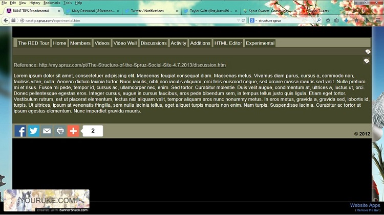
        Note that our site does not have the global sidebars enabled. Since it is not intended to be a social site for our clan, there is no real need for the sidebars. If we need them, we'll use a table, or CSS for them. Since most of the site will be text and image based, we probably don't need the large header image at the page top. For our example, I've created a new HTML page, "Experimental." The HTML editor has the most features among the available Spruz editors, and actually will attempt to correct errors you make in your CSS and HTML scripts.  Here's how our freshly made HTML page looks initially:


        Open the page editor, click the Source button and enter the following tags -- don't worry that the first style tag is not quite right, the editor will correct it:
       
        The empty paragraph tags are important. Without it, the editor will try to format your CSS as a body of text. Since we will need a large area of the page for our own text and images, we probably should hide the header and use that area for text. Going back to our element tree above, we find the container for the page header:   

        
        Let's get rid of the header by adding the CSS selector to hide the division:  div id="page-header" by adding  #page-header{display:none !important;} between the style tags on our page:

       
        This is how you hide things on the Spruz site -- display:none  !important; overrides previous CSS selectors, so the element doesn't inherit the display property from somewhere else. And here's how our page looks afterward:


        We've gotten rid of the entire header with just one line of CSS. Unfortunately, the login bar inherited the property position: absolute;  so it won't be moving anywhere else very soon. Also, the Like bar is sitting out in right field, so we'll have to deal with these two issues next.
        So that's how you hide elements on Spruz. It's just that simple. We just have to decide what elements need to be hidden, and that's what the element tree is for.
       Adding the style line:

    Hides all that we wanted to conceal:


    Reply
  • Reply
  • (continued)


    Reply
  • (continued)

    Reply
  • iframe test:
    Taylor Swift - Back To December (Live At The 2010th AMAs)


    Reply
  • Bumping bc I'm having trouble locating it -- lol.

    Reply
  • How to embed Twitter tweets on Spruz:

    We'll use the accounts of two well known celebs --


    @Desmond_Mary


    @taylorswift13


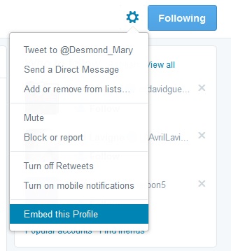
    Click on settings, choose "Embed this Profile" and follow the prompts -- easy:


    Reply
Please Sign In to Add a Comment
or

This website is powered by Spruz