|
|
|
|

|
|
|
Community of the Week
This week's featured community is The Alternative Society! The website -- which serves as a community for those interested in piercings and tattoos -- was created by Tainted_Zeal.
To put it simply, The Alternative Society is different from the other sites we've featured, and I'm pretty sure that's the way they like it. One of the worst things a site admin can do is make their site generic, yet it's a mistake that happens all too often. By defining what the community is there for Tainted_Zeal has made it more likely that quality members join.
Humans are social creatures that have a desire to be part of something bigger than themselves, which is why community sites have such a big draw. The best way to spur your site on to success is to decide what specific niche, or category, your site will represent. Remember: nothing brings people together better than a common interest. The Alternative Society is evidence of this fact.
Congratulations once again to Tainted_Zeal and everyone at The Alternative Society! Stop by their introduction post for more information.
It's almost time to vote for your favorite featured site. There is only one more site that will be featured, so if you'd like a shot at it post an introduction that follows the guidelines we've provided.
Suggestion of the Week
This week's suggestion comes from Hooey. They suggested that birthdays be automatically added to the Event Page if the site administrator selects the option in the feature settings page. He points out that there is already an element that can display the birthdays of members, but that it's not as personal.
If you've thought of a feature you'd like to see added to the Spruz platform feel free to post it in the Idea Room. Remember to make it as detailed as possible; all topics must be approved before they'll appear.
Tip of the Week
This week's tip is from our video library and shows you how to use access levels to make it easier to manage your site. It can take some time and thought to figure out how they'll be used in your site, but once the work is done it's well worth it.
|

|
|
|
Over the last few weeks we have been hitting the site management features pretty hard. As we complete new improvements, we have been rolling out updates. I want to update you on some of the latest changes and give you a sneak peak of things to come.
New Import/Export Theme Features
On your Appearance menu in your website management mode you will notice a new option called "From File" in the choose a theme section. This allows you to upload a theme file that was exported using our tools to import into your website. To export a theme we have added an option in the Advanced section of the Appearance menu called "Export Active Theme". Clicking this option compresses your theme files into a backup file that is then downloaded to your computer and can then be shared with other Spruz powered websites.
Many of you may remember we had a similar feature on the old management system. However it was one of the items we had to cut in order to meet internal deadlines.
New Content Templates Settings Section
On your Settings menu, directly under manage settings we have added Content Templates. This will replace the old system of storing and editing some of the system content templates from the file system. The Content Templates System is work in progress, from the content templates page you will be able to change much of the system text, messages and even templates used for displaying information like Blog Posts. Currently this system only has the Login Menu template, but this area will be expanded over time.
Misc Changes
-
We have applied a number of minor adjustments to the management menu, including rearranging some links.
-
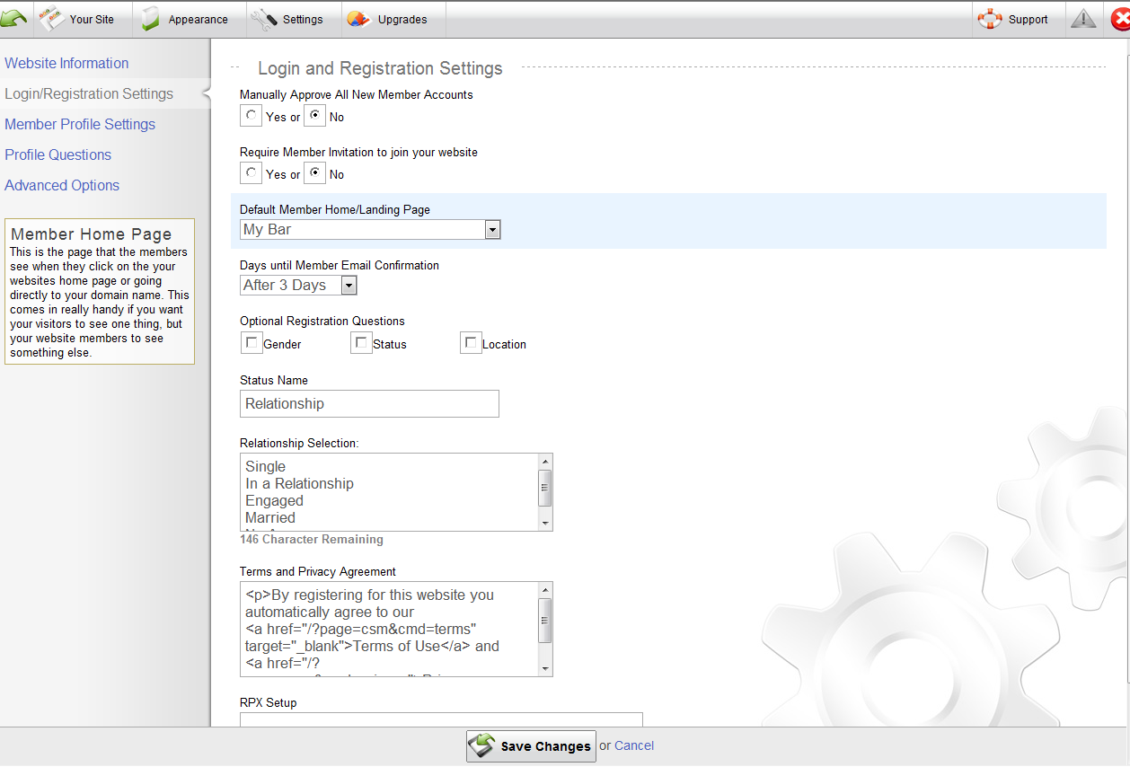
There is a new box on the Login/Registration settings to further customize your website description that displays on your registration page.
-
And of course a range of other adjustments and fixes that we continue to make on a regular basis that most of you may or may not notice.
This update is our Part 2 of the Platform Release we completed last week.
Coming soon..
Theme Contributions Page - This follow up to the theme import/export feature that will allow designers to create themes, export them, then publish the themes through a section on our Owners Community. From this page website owners can install or purchase, rate and comment on Themes added by our theme Contributors. In addition themes will display on the Theme Library on all websites so they can be quickly installed. We attempted to do this in the past but keep everything in the backend theme library, however this limited the exposé a feature like this needs for the success of it. A sneak peek at features designer will enjoy include; reports of how many times a theme is installed, setting up pricing options to ether give free themes or set a purchase price, and a designers profile that you can add your website address and bio to.
New Wiki/KB System - We have been developing a replacement for our current Knowledge Based module. Some highlights of this new feature will include; options for article editing, optional article categories, improved searching, and a range of settings that include enable commenting, who can edit the article and rating features.
Plus many other things in development that we can't discuss right now.
|

|
|
|
I hope everyone had a good week and a rest filled Saturday. Tomorrow's Easter and I'm ready to eat some candy-filled eggs (who isn't?!). To help keep things on track, all site introductions will be reviewed Monday at 6 EST. How's that for consistency! 
Community of the Week
It's my honor to announce that Mass Themes is the Community of the Week! The website was created by MassThemes and is a web design company.
Mass Themes takes the saying "First impressions are everything" to heart. The entire site has a very clean and uniform design to it. This helps ensure that all the pages feel like they're part of something bigger, though they each serve a unique purpose. Color is used sparingly but appropriately, drawing attention to things that are important, such as links. Every detail of the website has been customized, from the subtle yet defined background to the color of the icons in the Skysa bar.
Congratulations once again to MassThemes of, uh... Mass Themes! Stop by their [very creative] introduction post for more information.
Time is ticking away for the Spruz Community Competition, the winner of which will receive six months of free upgrades with Spruz among many other fabulous prizes. There are only two more sites that will be featured, so if you'd like a shot at it post an introduction that follows the guidelines we've provided.
Suggestion of the Week
This week's suggestion comes from Sol Olsen. They proposed that the "Invite" page get a revamp, making it much easier for members to use. The main change would be better categorization and a cleaner interface than what exists currently. Stop by the topic and share your opinion!
Tip of the Week
This week's tip is actually a collection of them provided by Gazac, the winner of last week's "Community of the Week" title. All of them make use of the easy to use "Custom Modifiers" system built into the Spruz platform.
It's possible to further customize what Gazac has shared with us even further to suit the needs of your site with CSS.
|

|
|
|
Today you may notice some changes with your management bar and settings pages. Today's update brings some changes that improve usability, and offers some new site and login options. This update opens the doors to some really awesome new features that you will have access to in the near future. The parts of this update you will notice the most include, improved design and navigation for changing website settings, registration settings, default profile settings, profile questions, and advanced options.

In this update we have discontinued the Website Intro feature but we have added a new feature that gives you ability to set a different home page for your members. Thus you can have one home page that your visitors see by default and one for your members. The reason behind the Intro removal is many. Part of our obligation to you is to help you grow your website, you may not realize this but intro or splash pages increase website bounce rates by over 150%. While some may feel intros are cool to use, for your visitors and future members having an intro in place can give people one more hoop to jump through to get to the content of your website. For Spruz, the intro feature was one more option that our system has to manage. Thus because of this, we feel it is best to discontinue this feature.
Here is a Break Down of the changes:
-
Site Settings, and Profile Settings Options - These links have been merged into Manage Settings
-
New Design - A new design was applied to the settings pages to give it a cleaner more organized look.
-
New Settings Arrangement - The manage settings page has been broken up into differant areas you can change settings for. This should make it much easier to find settings
-
Inline Help - Often it is hard to understand what each setting controls, and why it's there. Each option now features a help block that gives more in-depth detail quickly when you hover over, or click on an option. This replaces the old Question Mark you had to click on.
-
Terms and Privacy Agreement - You can customize what your members agree to when they join your website. We have started you out with a template to use if you don't want to make your own.
-
Custom your members start page - This is a feature you will only find on the Spruz Platform. With this setting you can set a different start page for your members. See an example at www.Sweetuniverse.net or www.skysa.com
In part 2 we will have a new content template management page, that will open the door for eventually being able to change all the default text in the platform, even create your own language packs. For example the Login Menu Templates are already controlled by this system. We will be expanding this functionality to all systems. Part 2 will include a new management page to update and set your template with a similar look that was used for the new site settings pages.
We do hope this update makes things easier to find and manage for our new users. Again if you have problems because of this update DO NOT COMMENT, Commenting will not help you. Please use the support ticket area to report all issues.
Thank you,
The Spruz Team!
|

|
|
|
Life's unpredictable, and there's nothing better than a week with almost no internet access to teach you that. From this week on the Community Spotlight will be posted on Saturday instead of Friday, which will help ensure it gets out when it's supposed to. 
Community of the Week
I'm happy to announce that Elite Tactical Gamer is our Community of the Week! The website was created by Gazac and caters to those who enjoy first person shooters.
This website is a great example of how customizable websites built on the Spruz platform are. With a little CSS knowhow it's possible to make your site stand out from the rest. Small changes like the navigation buttons moving when they're clicked on give the site just that much more personality. If you look at the rest of the home page you'll see plenty of other examples, such as the "ETG Blog" and "Recent Posts" elements having a unique header to help draw attention to them. Customization may take some time, but it's well worth it!
Congratulations to Gazac and all the Elite Tactical Gamer community! Stop by their introduction page to learn more about the site. You can also stop by their topic requesting feedback on the new design.
This marks the halfway point for the Spruz Community Competition. There are still three more sites that will be featured, so if you'd like a shot at it post an introduction that follows the guidelines we've provided.
Suggestion of the Week
This week's suggestion is fragnoli's. He recommends that each member be given their own RSS feed which others can subscribe to if they like a specific writer. Sites with several writers would certainly benefit from this as users would only be alerted to content they know they'll want to read. If you have any more ideas on how it can be improved stop on in the thread and share it with the rest of the community.
Tip of the Week
This week's tip is one that was posted a while back but that I'm sure many users will find helpful, and explains how to get out of CSS mode. If you switch into "CSS Mode" (an advanced option that makes it easier to customize your site with CSS) it makes it impossible to use the regular editing features found under "Customize" in the "Appearance" tab. Generally it's impossible to get out of this mode, but one member has found a way to change it if you entered CSS mode and realized it wasn't what you wanted.
|
|
|
|
|
|
|
|
|
|
|
|
|
|
|